The Icon Block 1.4.0 Release – What's New and How I Built It
A new year has begun, and with it, a fresh release of the Icon Block. This little plugin grew 1300% in 2022 and recently surpassed 7,000 active installs.
There are tons of great icon plugins in the WordPress ecosystem, free and premium. Most have more features and functionality than the Icon Block. However, what makes this block different is its strong commitment to WordPress's core design principles.
The goal was always to make the block feel like it belonged in WordPress itself. I have strived to use as many core block supports and components as possible. Version 1.4.0 stays true to this effort with much-needed enhancements.
In addition to reviewing the changes to the Icon Block in this article, I included a few How I Built This sections with various tips and tricks. This is something I am going to start doing more and more.
Building custom blocks can sometimes be tricky, and we all write better code by learning from others. That also means I would love feedback if you think I should have done things differently. Reach out at @nickmdiego.
Enhancements
Version 1.4.0 focused on tackling several feature requests, Global Styles compatibility, and improving existing functionality. To ensure the Icon Block is utilizing the latest WordPress has to offer, the minimum required version was also bumped to WordPress 6.0. Let's dive into the details of this release.
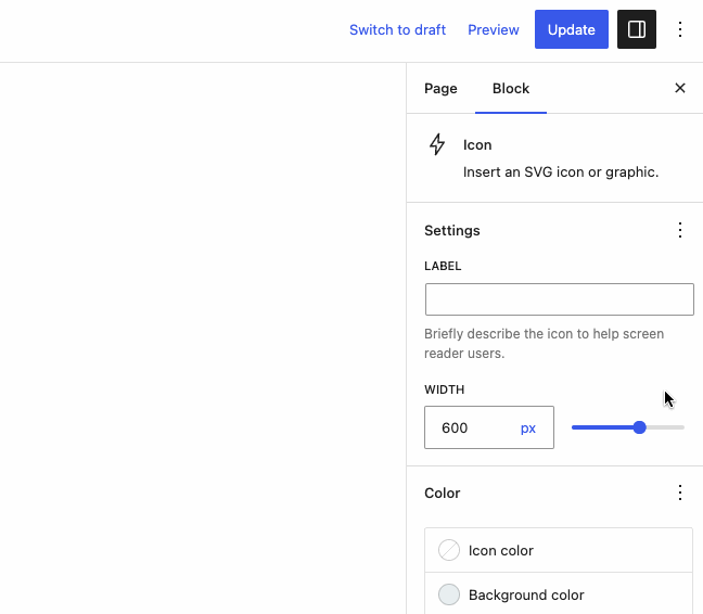
Improved the Icon Width Control
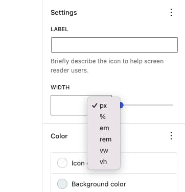
Icon width has been supported in the block since version 1.0.0. The original width component mirrored the width control currently used in the core Image block, which is quite restrictive. While a user can change pixel width or select from four percentage-based values, there is no option for additional units like in other dimension controls.
After numerous feature requests, version 1.4.0 introduces a new icon width control that supports %, px, em, rem, vh, vw, or whatever set of units is defined in theme.json.
How I Built This
This new control needed to function like other dimension controls you now see in WordPress 6.1. Wanting to use a core component, I dove into the Gutenberg Block Editor components library. The HeightControl caught my eye and was exactly what I needed.
This control was added to Gutenberg in November 2022 and, unfortunately, does not yet exist in WordPress core, making it unusable for my purposes. Luckily, it is built out of components that have been in WordPress since 6.0. I ported the code from the HeightControl over to a custom DimensionControl in the Icon Block and made a few modifications to meet my specific needs.
My favorite feature of this new component is that the available units are compatible with Global Styles. If a theme defines a set of units in theme.json, they are pulled in via useSetting( 'spacing.units' ) and only those units are available to the end user.
I had never experimented with useSetting() before, and seeing it in HeightControl has given me ideas for more custom components that support theme.json settings. It's a good reminder that Gutenberg is the best resource when building custom blocks designed to blend into WordPress core.
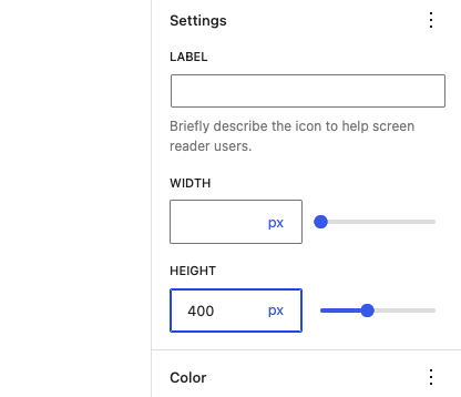
Added Icon Height Support
In addition to requesting more supported units, one of the first feature requests I received was for height control. In most cases, width control is all you need to determine the size of an SVG icon. But once you introduce additional units like vh, height becomes quite useful.
After building the new DimensionControl component for icon width, adding height was trivial.
One thing to note is that I choose to exclude % from the height unit options. Using % can have unexpected results based on the icon's container height and is quite unintuitive.
Improved Color Support
When the Icon Block was first built, the Site Editor had not been released yet. While the block used native color pickers for both icon and background color that supported the current theme's color palette, no consideration was made for Global Styles. Therefore, color values were hard-coded to the block output. While this is fine for custom colors, things break down when using theme colors.
Say your theme has a primary color defined in theme.json. You set the icon color to primary, which applies the primary color's hex value to the block. Everything works as expected.
But what happens when the user changes the primary color in Global Styles? Or what if they install a new theme with a different primary color? Or perhaps they select a new style variation like in the Twenty Twenty-Three theme?
Unfortunately, the icon will not change color to reflect the new primary color since the original hex value was hard-coded to the block. Not a great experience when we are aiming for "Full Site Editing."
To fix this, theme colors are now handled differently in version 1.4.0. The hex value is hard-coded as a fallback, but all colors defined in theme.json are controlled using CSS classes, which is how nearly all core WordPress blocks operate.
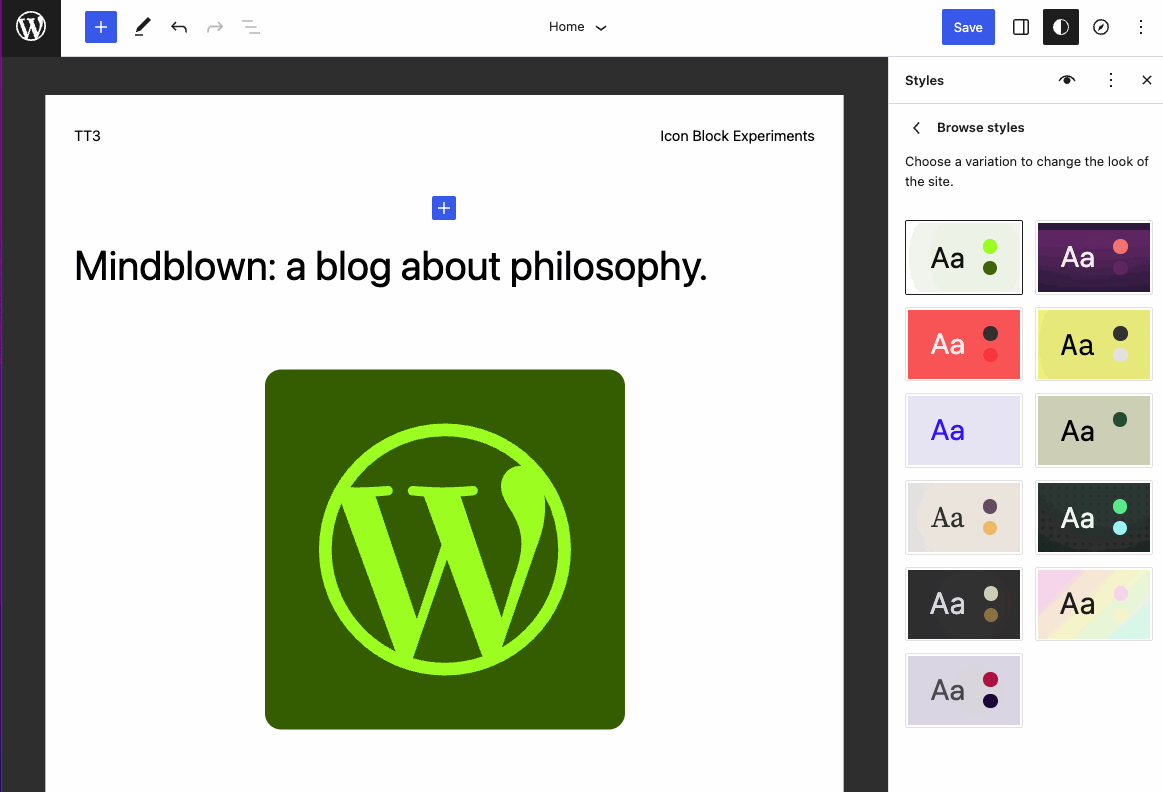
Here's a look at style variation switching in action using the Twenty Twenty-Three theme. Icon color and background color are set to primary and secondary respectively.
New Settings Panel Design
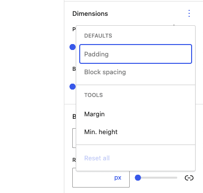
The final major update in version 1.4.0 is a redesign of the block settings panel. Inspector panel design has changed significantly in WordPress core throughout 2022. Panels generated by core block supports, such as typography and dimensions, are populated with a set of default controls. Then from an options menu, you can add additional functionality or reset configured block controls.
Last month, I updated the block inspector panel in Block Visibility with a similar implementation. Much of what I learned there was easily applied to the Icon Block. The icon label and width settings are defaults, and the new height control can be added from the options menu.
How I Built This
In WordPress, this panel design is generated using the experimental ToolsPanel component. This component is quite prescriptive as it was designed for block supports, and I had trouble getting it to work exactly the way I wanted. Therefore, I built my own OptionsPanel component that replicates the functionality. While custom, it's still composed almost entirely of core components, notably DropdownMenu, MenuGroup, and MenuItem. Not as elegant as the ToolsPanel, but it gets the job done and provides a consistent user experience.
Looking Ahead
As Site Editing and block themes become more common, I believe it will be imperative for custom blocks to play nicely with this new functionality. The Icon Block has come a long way since its initial release in 2021, but so has WordPress. I look forward to continuing to incorporate new functionality and core components as well as user feature requests.
You can follow along with current feature requests on the project’s GitHub repository, but here are a few highlights of what’s next on my list.
- Allow users to insert custom SVG icons from an "uploaded"
.svgfile. - Explore ways to integrate with third-party icon libraries.
If there is something that you would like to see, feel free to add your own issues on Github. In the meantime, you can stay tuned for more updates by following @theiconblock or myself on Twitter.