Adding Custom Icons to the Icon Block
Since its release, the Icon Block for WordPress has included a basic library of icons sourced from @wordpress/icons. The block also allows you to insert custom SVG icons ad hoc, but this can be tedious, especially if you're inserting the same icon over and over.
I always intended for users to be able to add their own icons to the block itself. Over 4,000 active installs later, enabling custom icon libraries is by far the most common feature request.
Well, I am pleased to announce that this is now possible as of version 1.2.0 and this article will show you how.
Getting Started
The Icons Block is a static block built almost entirely with JavaScript, more specifically, with React. Therefore, icons need to be added using JavaScript but don't worry. It's quite straightforward.
I am going to assume that you want to register a custom icon library in a WordPress theme. You could also adapt the following steps for a custom plugin.
In the function.php file of your theme, add the following:
function example_register_custom_icons() {
	wp_enqueue_script(
		'example-register-custom-icons',
		get_theme_file_uri( '/assets/js/register-custom-icons.js' ),
		array( 'wp-i18n', 'wp-hooks', 'wp-dom' ),
		wp_get_theme()->get( 'Version' ),
		true // Very important, otherwise the filter is called too early.
	);
}
add_action( 'enqueue_block_editor_assets', 'example_register_custom_icons' );This should be familiar to those that have enqueued scripts and/or styles before. A couple of things to note:
- The path to the JavaScript file can be anything. I generally organize my asset files in their own folder, but it's up to you.
- The array defines the WordPress dependencies that we'll need.
- The
trueat the end is very important. It tells WordPress to load the file in the footer rather than the header. This file needs to be loaded after the Icon Block.
Finally, create the blank register-custom-icons.js file. Name the file whatever you like, just make sure it's correctly referenced in the enqueue function above.
Now we're ready to add a custom icon library.
Adding Custom Icons
Let's start with the complete example implementation, and then we'll walk through each section. In the register-custom-icons.js file, add the following:
// Add custom icons to the Icon Block.
wp.domReady( () => {
const { __ } = wp.i18n;
const { addFilter } = wp.hooks;
function addCustomIcons( icons ) {
const customIcons = [
{
isDefault: true,
name: 'bookmark',
title: __( 'Bookmark', 'icon-block' ),
icon: '<svg width="24px" height="24px" viewBox="0 0 24 24">
</path></svg>',
categories: [ 'category-one', 'category-two' ],
},
{
name: 'cloud',
title: __( 'Cloud', 'icon-block' ),
icon: '<svg width="24px" height="24px" viewBox="0 0 24 24">
</path></svg>',
categories: [ 'category-one', 'category-two' ],
},
{
name: 'heart',
title: __( 'Heart', 'custom-icons' ),
icon: '<svg width="24px" height="24px" viewBox="0 0 24 24">
</path></svg>',
categories: [ 'category-one' ],
keywords: [ 'love' ],
},
{
name: 'mail',
title: __( 'Mail', 'custom-icons' ),
icon: '<svg width="24px" height="24px" viewBox="0 0 24 24">
</path></svg>',
categories: [ 'category-one' ],
},
{
name: 'search',
title: __( 'Search', 'custom-icons' ),
icon: '<svg width="24px" height="24px" viewBox="0 0 24 24">
</path></svg>',
categories: [ 'category-two' ],
},
{
isDefault: true,
name: 'user',
title: __( 'User', 'custom-icons' ),
icon: '<svg width="24px" height="24px" viewBox="0 0 24 24">
</path></svg>',
categories: [ 'category-two' ],
},
];
const customIconCategories = [
{
name: 'category-one',
title: __( 'Category One', 'example-theme' ),
},
{
name: 'category-two',
title: __( 'Category Two', 'example-theme' ),
},
];
const customIconType = [
{
isDefault: true,
type: 'example-icons',
title: __( 'Example Icons', 'example-theme' ),
icons: customIcons,
categories: customIconCategories,
},
];
const allIcons = [].concat( icons, customIconType );
return allIcons;
}
addFilter(
'iconBlock.icons',
'example-theme/example-custom-icons',
addCustomIcons
);
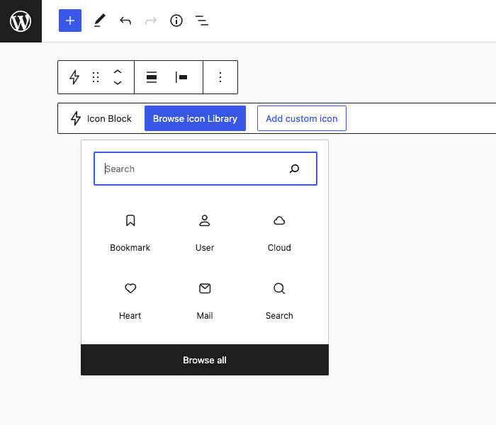
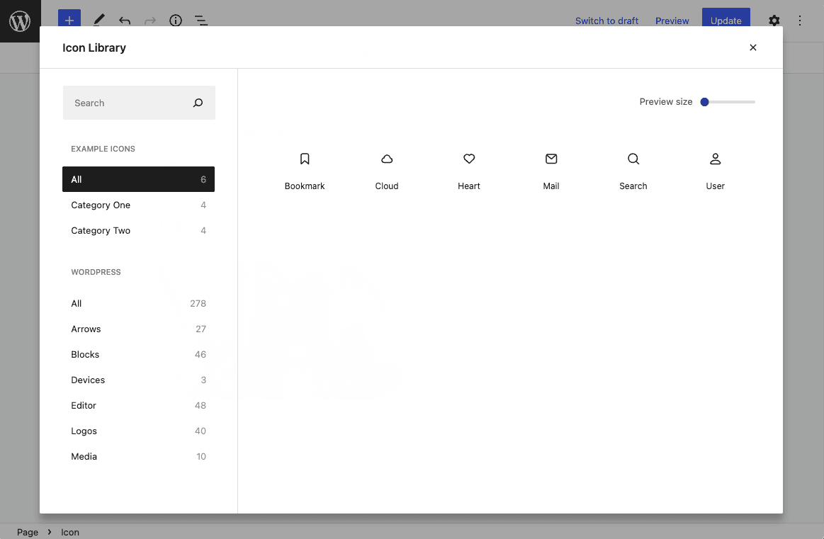
} );This code will add 6 new icons to the Icon Block. They will appear as their own icon type called "Example Icons". We have also registered two icon categories.
Here are a few screenshots of what the finished product looks like:
The Filter
Let's simplify the code above. You'll see that we are passing a callback function to the filter iconBlock.icons.
// Add custom icons to the Icon Block.
wp.domReady( () => {

	const { __ } = wp.i18n;
	const { addFilter } = wp.hooks;

	function addCustomIcons( icons ) {

		const customIconType = [ ... ];

		const allIcons = [].concat( icons, customIconType );

		return allIcons;
	}

	addFilter(
		'iconBlock.icons',
		'nick-diego/example-theme/example-custom-icons',
		addCustomIcons
	);
} );The function and filter need to wrapped in wp.domReady(), which is one of the dependencies we included in the enqueue function. I have also simplified the other dependencies so they're a bit easier to work with, but this is not required.
addFilter() is part of the Hooks API and is very similar to the PHP add_filter() function. The first parameter is the filter itself. The second is a unique namespace, which can be anything, but generally follows the format vendor/theme/function. The final parameter is the callback function.
The callback function addCustomIcons() accepts a single parameter icons that's an array of all icons currently available in the Icon Block. By default, this would be the base icon library provided by @wordpress/icons.
Once an array of custom icons is defined in customIconType, which we'll talk about next, I have concatenated the original icons array with the new array. You could also remove the WordPress icons from the plugin entirely and just use your custom icons. To do so, return customIconType instead of allIcons in the code above.
Icon Type
Custom icons are added to the Icon Block by defining an icon type. In the following example code, I have defined the type "Example Icons". You can register multiple types.
const customIconType = [
  {
    isDefault: false,
    type: "example-icons",
    title: __("Example Icons", "example-theme"),
    icons: customIcons,
    categories: customIconCategories,
  },
];An icon type is defined by five parameters. All are required unless specified:
isDefault– Defaults tofalse. Determines if icons in this type should appear first in the Quick Inserter and Inserter Modal. (optional)type– A slug to define the icon type.title– A descriptive title for the icon type.icons– An array of all custom icons in the icon type.categories– An array of all icon categories in the icon type. (optional)
Icons
Next, we need to add the icons themselves.
const customIcons = [
	{ ... },
	{
		isDefault: false,
		name: 'heart',
		title: __( 'Heart', 'custom-icons' ),
		icon: '<svg width="24px" height="24px" viewBox="0 0 24 24">
</path></svg>',
		categories: [ 'category-one' ],
		keywords: [ 'love' ],
		hasNoIconFill: false,
	},
	{ ... },
];Icons in the customIcons array are defined by seven parameters. All are required unless specified:
isDefault– Defaults tofalse. Determines if the icon should be displayed first in the list of available icons. (optional)name– A slug to define the icon.title– A descriptive title for the icon.icon– A string of the SVG code that makes up the icon.categories– An array of category names that the icon belongs to. (optional)keywords– An array of keywords that help define the icon. Keywords are used when the user is searching for icons. (optional)hasNoIconFill– Defaults tofalse. Set totruefor icons that usestrokeattributes and/or should not have a color fill applied. (optional)
Categories
Finally, we need to define icon categories. Categories are optional, but they are a great way to organize your custom icons.
const customIconCategories = [
  {
    name: "category-one",
    title: __("Category One", "example-theme"),
  },
  {
    name: "category-two",
    title: __("Category Two", "example-theme"),
  },
];Categories in the customIconCategories array are defined by two parameters. All are required:
name– A slug to define the icon category.title– A descriptive title for the icon category.
That's it. You can now add your own icon library to the Icon Block!
Closing Thoughts
There are a few tips I wanted to share regarding custom SVG icons, especially if you are designing them yourself.
- To take full advantage of the Icon Block and its internal controls, I recommended converting all SVGs to outlines if possible.
- Flatten your SVGs before exporting them from your design application. This will generally make the string smaller.
- After exporting from your design application, remove all unnecessary markup from the SVG code. This will make the string smaller and easier to work with.
- Unless you need SVGs to be a specific color, remove
filland other color values. Icon color can be controlled from within the block. - If your SVG does need to include fill or other color values, make sure they are added to the SVG itself. The block will strip any
<style>markup included with the SVG.
To follow Icon Block development, star the repository on GitHub or follow on Twitter. If you have any questions or a feature that you would like to see, let me know.